Playing With Pastels
I’ve been working with pastels lately since I bought a new set last year. My old collection of dried-out, tiny bits needed a replacement. Whenever I switch media, I take some time to familiarize myself with my technique, the medium’s feel and look. Using pastels is very different from using paints such as acrylic or watercolor.
Working with pastels is like using crayons or colored pencils. You don’t mix them on a pallet, but apply them to your canvas (usually paper) directly and blend them as you use them. They are powdered pigments combined with a binder and come in many forms.
Soft Pastels
Soft pastels are commonly used and consist of a gum binder in various amounts. This media is very much like chalk. Types of soft pastels with more binder are great from fine detail but are less brilliant. Sometimes, colorful pigments are made without a binder and applied with a soft sponge. They have a powdery characteristic that allows the artist to blend and create different colors, but they smear easily and usually require a fixative when complete.
Oil Pastels
Oil pastels use an oil-and-wax binder, making them soft and greasy rather than soft and powdery. Artists can build them up on the surface, much like the impasto style. You can also move the media around the canvas with a razor blade or craft knife. These don’t blend as easily as soft pastels but don’t require a fixative.
Water Pastels
Water pastels are similar to soft pastels but contain a water-soluble component. I like to consider them a hybrid of soft pastels and watercolor paints. You apply them to your canvas as soft pastel, but you can use a wet paintbrush to blend them or work them like watercolor.
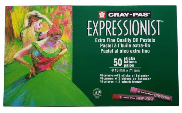
I chose to work with oil pastels, and I bought a mid-range quality from Cray-Pas. They have a large selection of colors in this set and include two blender sticks (unpigmented pastels). You can check out the colors available on my Instagram post.

Working with pastels always takes me back to coloring with crayons as a kid, but I don’t want my art to look childish. Pastels are challenging to work with since you can’t blend them before applying them to your canvas. You also can’t fix errors by coving them up since they smear and blend. So, I created a color chart to match my set and made a few test blends to document the outcome.
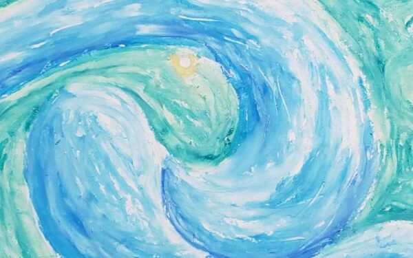
I plan to use this media to create pieces inspired by Van Gogh’s impressionistic works. One of my favorites is The Starry Night. Van Gogh used oil-on-canvas for this work, but I thought I could get a similar look with my pastels.
I decided to layer the pastel medium with a long or drawn-out stippling technique on standard printer paper and Canson Mixed Media paper. I chose a small palette and added the colors, allowing some strokes to blend and others to remain distinct. The layering allowed me to try a sgraffito technique by scratching off a top layer with a craft knife and letting a lower layer show through.

I love the look and feel of pastels, but I developed a pet peeve for the mess left behind. The short strokes caused crumbs to form on my piece. Sometimes these would be from contrasting colors, and I couldn’t blend them in without smearing them into an ugly mess. Most of the time, I could blow or shake them off the paper, but some required picking with a kneaded eraser or knife blade.
Since I like to have a digital version of my works on my computer, I scanned some practice pastel pieces to see how they transferred. Some media, such as watercolor, lose vibrance or opacity once scanned. The pastels appeared to hold their true colors, and even their texture was visible. Although, any little crumbs I missed during my removal process found their way onto the glass of my scanner. I recommend thoroughly cleaning the surface before and between scans to prevent blemishes.
All in all, I am pleased with my pastels. They give me another medium and options for new and interesting works. The types, brands, and prices vary, so I recommend artists experiment a little until they find what they like best.


