Illustrating Challanges
My next book is in the review process and I have been slaving away at the illustrations. Always Feed Your Chocolate Bunny is an instruction manual for adolescents to help them cope with stress. I chose to keep the illustrations simple, and in black and white.
I found happy chocolate bunnies to be easier to draw than grumpy monster bunnies. However, my biggest challenge has always been people. I studied illustrating animals longer than illustrating people, and I struggle with getting their proportions just right. I had to reteach myself the fundamentals on getting them right. Luckily, this book offers me the ability to stretch the parameters and lean towards the cartoon side of illustrating.
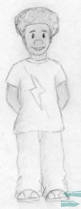
Here is an example of one of the children I was working on:

As you can see, the legs are proportionally off from the rest of the body. A rule of thumb is to have the body eight heads high. Therefore, I had to redo the legs and make them longer.
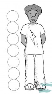
Here is the final version of the body:

I actually still kept them slightly shorter, by using only seven heads, since kids’ proportions are different from adults. I have five teens to complete for the main illustration, and I will apply the same technique to all of them.
Though I prefer to draw animals, it felt good to stretch my abilities and challenge myself.


